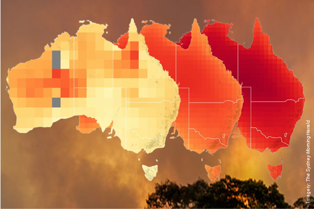
The Sydney Morning Herald displays in an article, "How heat became the ‘silent killer’ stalking Australia", interactive maps for exploring the full changes and projections data for Australia, based on projections by the Intergovernmental Panel on Climate Change. One shows how much average annual temperatures changed between 2000 and 2021 – an increase between 0.2°C and 1.6°C. "Middle of the road projections" shows how much temperatures are projected to increase by 2041-2060 under the SSP2-4.5 emissions pathway, compared to 1981-2010 baseline temperatures. "Worse-case projection" shows temperatures increasing by 2041-2060 under the SSP5-8.5 emissions pathway, where global greenhouse gas emissions continue to increase significantly until near the end of the 21st century.


How much more proof do the climate change skeptics and deniers need? Alternatively, they can experience first-hand the increasing heat and resulting environmental harm and human suffering in Australia.